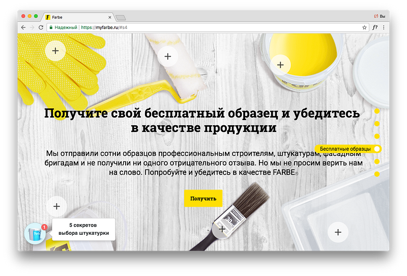
I’ve been shown a cool fancy site with an adaptive layout, smooth and fast animations, nice packshots and so on.
But after a while, the site starts to show a popup in the worst way possible: buy now, 2 days left only, stocks are limited and so on.
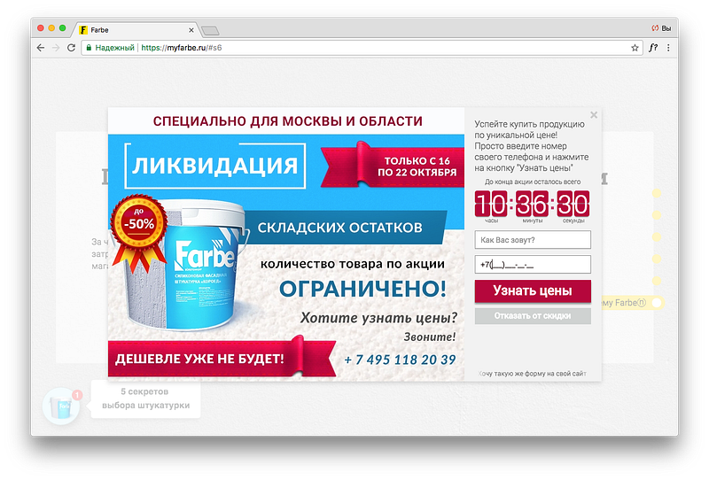
Such popup is the last resort of the marketer: the site he has designed to attract new leads doesn’t deliver, so he adds a popup to boost sales. It’s like shouting.
The same way in the presentations. If a speaker says: “There is a problem” — it’s like a popup. The speaker is in such desperate need of evidence (which he hasn’t) to convince his audience, that he tries to emotionally bias your perception of points that would follow.
Does it mean you should ban that phrase forever? I don’t think so. If you’re limited to 2 minutes pitch, you may use such phrase. It works the same way, but its purpose not to bias perception, but to focus the audience on what things you consider as a problem. Consider it a usability shortcut here for an intelligent and critical-thinking audience.
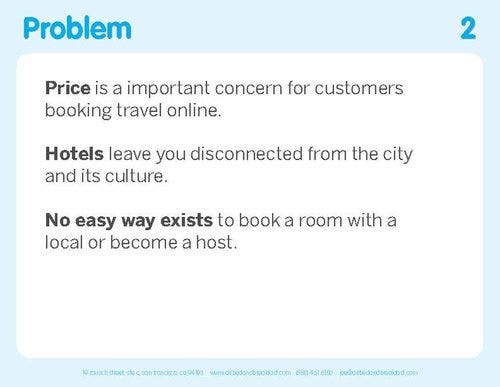
AirBnB slide deck, slidebean.com
What’s the best way? The best way is to just lay down all your facts and assumptions in a narrative structure. Without shortcuts, if possible. Let the audience to decide whether there is a problem or not. Of course, it will make your whole communication longer, but more intelligent, more respectful. It will be more like a conversation between two equals, but not between an adult and a child.
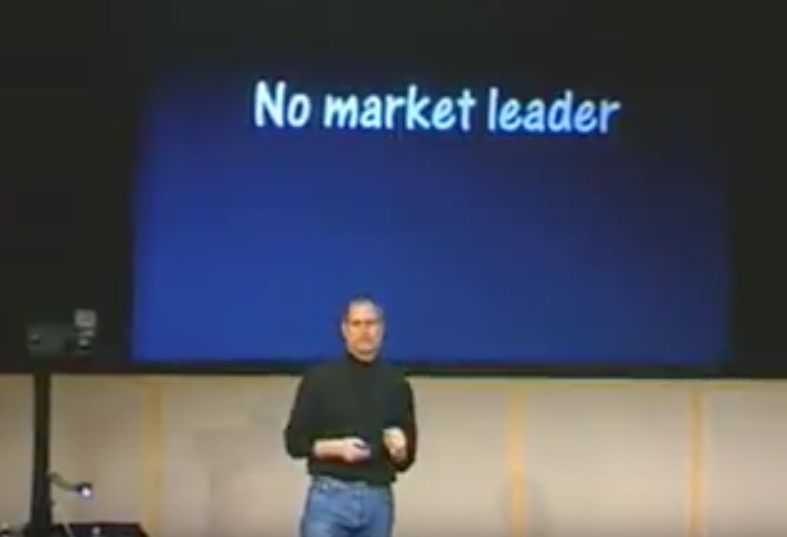
At iPod presentation in 2001, Steve Jobs didn’t say: “There is a problem, because of this and that”. Instead, he talked about the market, music players from various vendors: there cons and pros. So, in the end, you would have got his idea of what the problem was.
So next time you are about to say “there is a problem…” just ask yourself “Am I doing this as a usability shortcut for a 2 minutes pitch or just trying to bias the audience perception because I don’t have enough evidence”. If it is the latter case —please, don’t go that slippery road. Instead do a proper research — find evidence.

