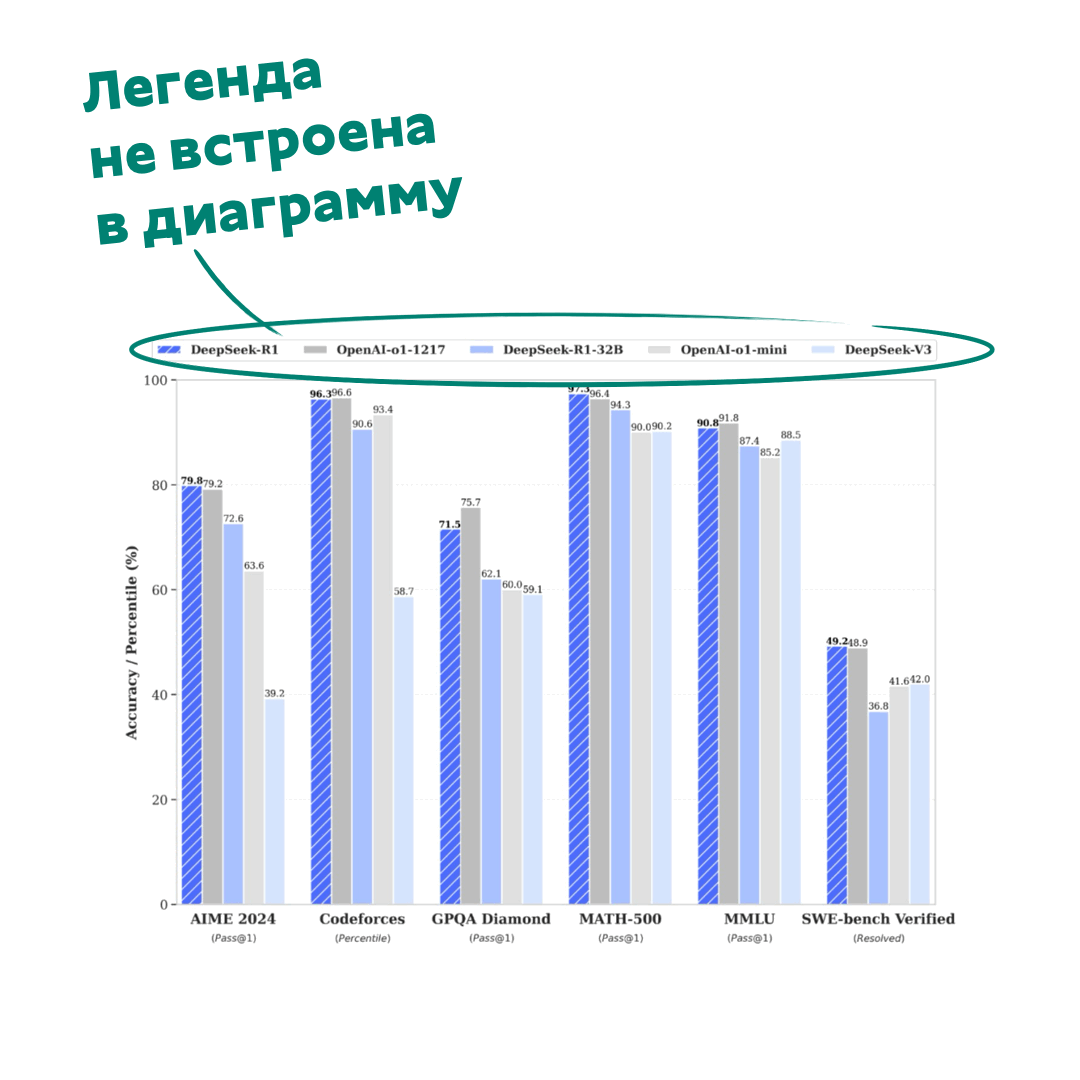
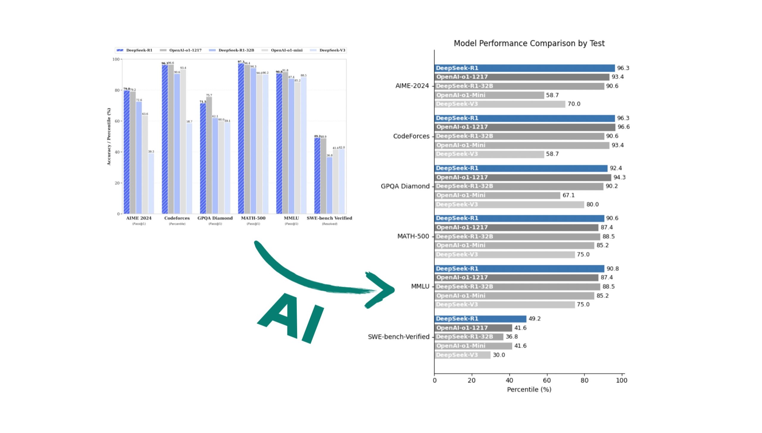
Глаз начинает дергаться, как только вижу чужую столбиковую диаграмму с легендой, которая заставляет играть в “теннис” — больше 2-х значений в легенде и я уже не данные смотрю, а качаю зрение.
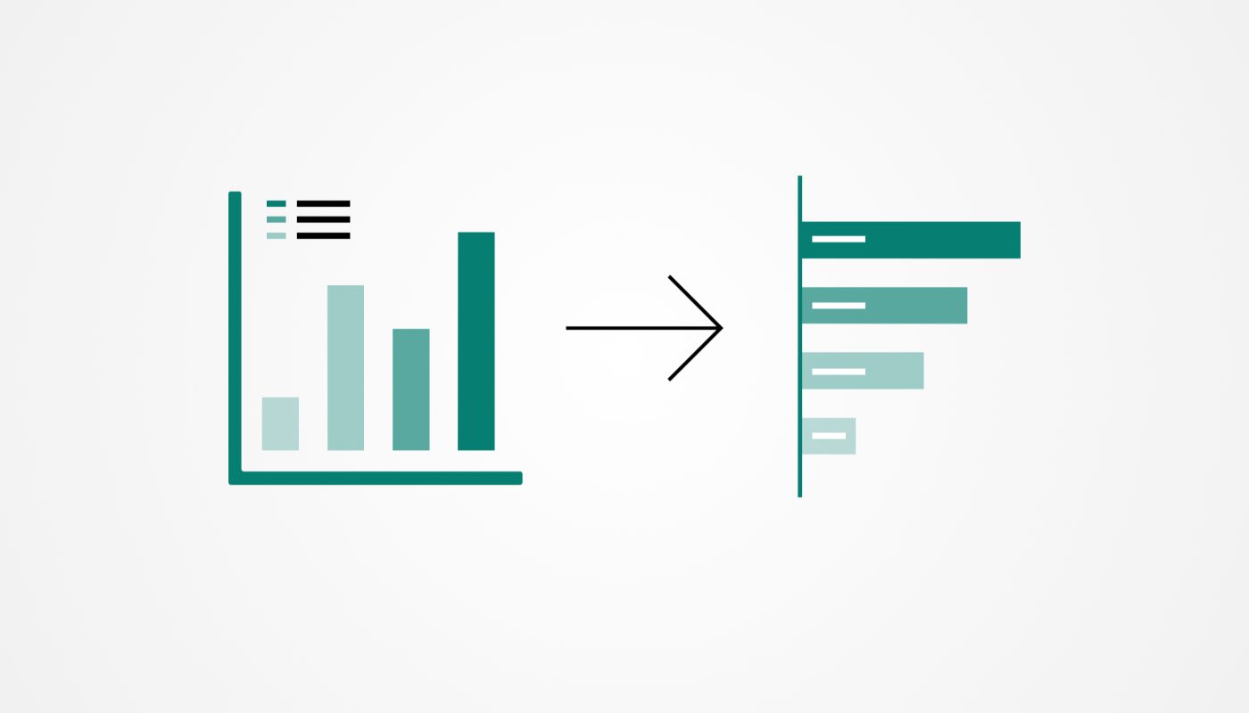
Ладно бы диаграмма была в редактируемом формате PowerPoint — превратил столбики в полоски, сделал человеческие горизонтальные подписи, и вот она, красота за 5-10 минут. А если использовать ThinkCell/Ampler, то еще быстрее. Но нет, ведь бывает прилетают и «скриншоты», а рисовать все с нуля… ну такое себе развлечение
Слава богу у нас есть AI, который это может сделать за меня.
Промпт:
1. Remove the separate legend
Eliminate the legend box and incorporate series labels directly into the bars for a self-contained design.

2. Group related series for each category
Ensure all related bars are plotted side by side for each category to provide clear groupings.

3. Separate series labels and actual values
– Place the series name at the beginning of each bar (only inside near the base of the bar).
– Place the actual value at the end of the bar for clarity and easy interpretation.

4. Use distinct colors
Assign each series a unique color to help visually differentiate between them.

5. Switch to a horizontal bar chart for readability
Use horizontal bars to allow easy reading of both labels and values. Text labels should remain in a natural horizontal orientation.

6. Add clear axis labels and titles
– Label the x-axis with the data being measured.
– Add meaningful y-axis labels (e.g., benchmark categories) and a clear, concise chart title.

7. Ensure minimalist, clean design
– Adjust font sizes, spacing, and layout to avoid clutter.
– Use thin gridlines and subtle colors to improve readability without distraction.
– Avoid unnecessary decorative elements that do not contribute to understanding the data.

8. Label positioning considerations
– Ensure labels (both series names and values) do not overlap or crowd.
– Use contrasting text colors where necessary (e.g., white text on dark bars and black text on light bars).

9. Check again that the visualization does not have any legend box, values of the bars are at the end of them, names of the bars are inside each bar)

10. Save and format the visualization
– Export the chart in high resolution for use in presentations or reports.
– You may write a code to run that will generate the final visualization
Метод не универсален:
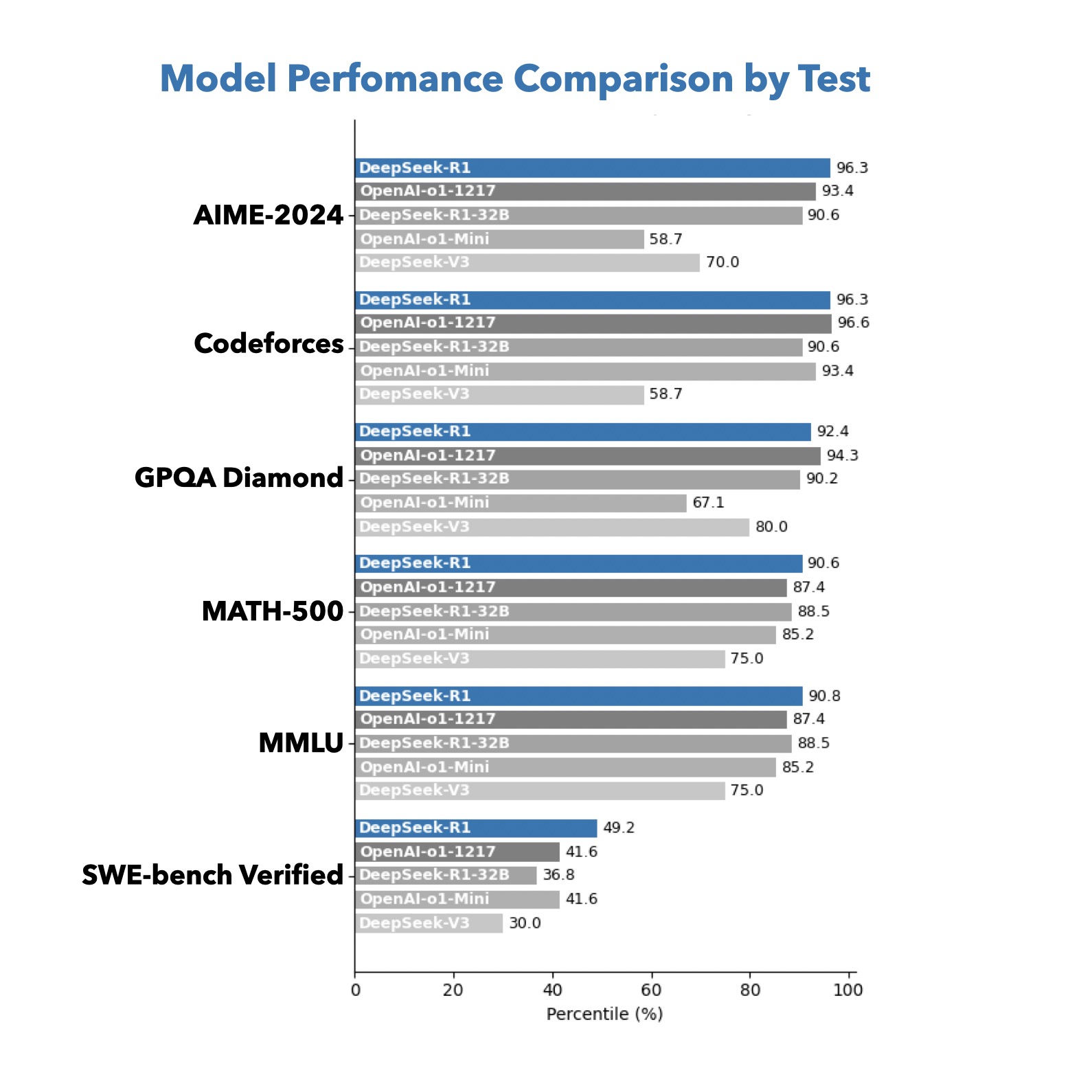
- AI что что-то недосканирует из значений столбиков (DeepSeek ошибается чаще, ChatGPT 4o/o1 реже), но если цифры были некрупные или их вообще не было, то придется надиктовать вручную
- Генерит диаграммы шаблонно — под вкусовщину/фирстиль придется еще 2-3 команды дать:
— а сделай буквы полосочек жирней и белым цветом
— а добавь воздуха между полосочками сете и т.д.
— а выдели полосочку с именем Х синим цветом везде
— часть такой текстовой вкусовщины я предпчитаю сделать сразу в Keynote/Powerpoint
Зато на выходе легко сканируемая диаграмма. Видно, что ее рисовал AI, но зато мы съэкономили полчаса своей жизни.