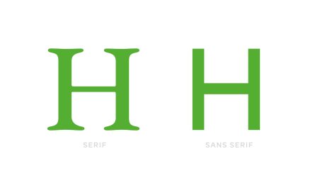

Another myth is busted. “Serif typefaces are more legible” they said. It seems not anymore. Researching articles don’t support that. Both classes of typefaces have about the same legibility.
But here’s the part that really blew my mind: since the ’80s, teachers have been saying that children understand alphabets better in typefaces WITHOUT serifs (are you laughing now?) So adults are better at serifs, but children are better at sans serifs. How’s that?! Well, okay, I went and googled “alphabet” and for every 20 pictures of the alphabet in sans serif fonts there are only 5 alphabets in serifs (i.e. that bias still lives on). But the real beauty of this mess is that children themselves are unaware of such preference of their own – they perceive alphabets with and without serifs equally in tests. (1)
It seems that now the choice between serif and sans serif typeface is purely stylistic.
Sources:
- http://alexpoole.info/blog/which-are-more-legible-serif-or-sans-serif-typefaces/
- https://geniusee.com/single-blog/font-readability-research-famous-designers-vs-scientists
- https://www.researchgate.net/publication/7661546_Serifs_and_font_legibility
- https://www.ncbi.nlm.nih.gov/pmc/articles/PMC4612630/