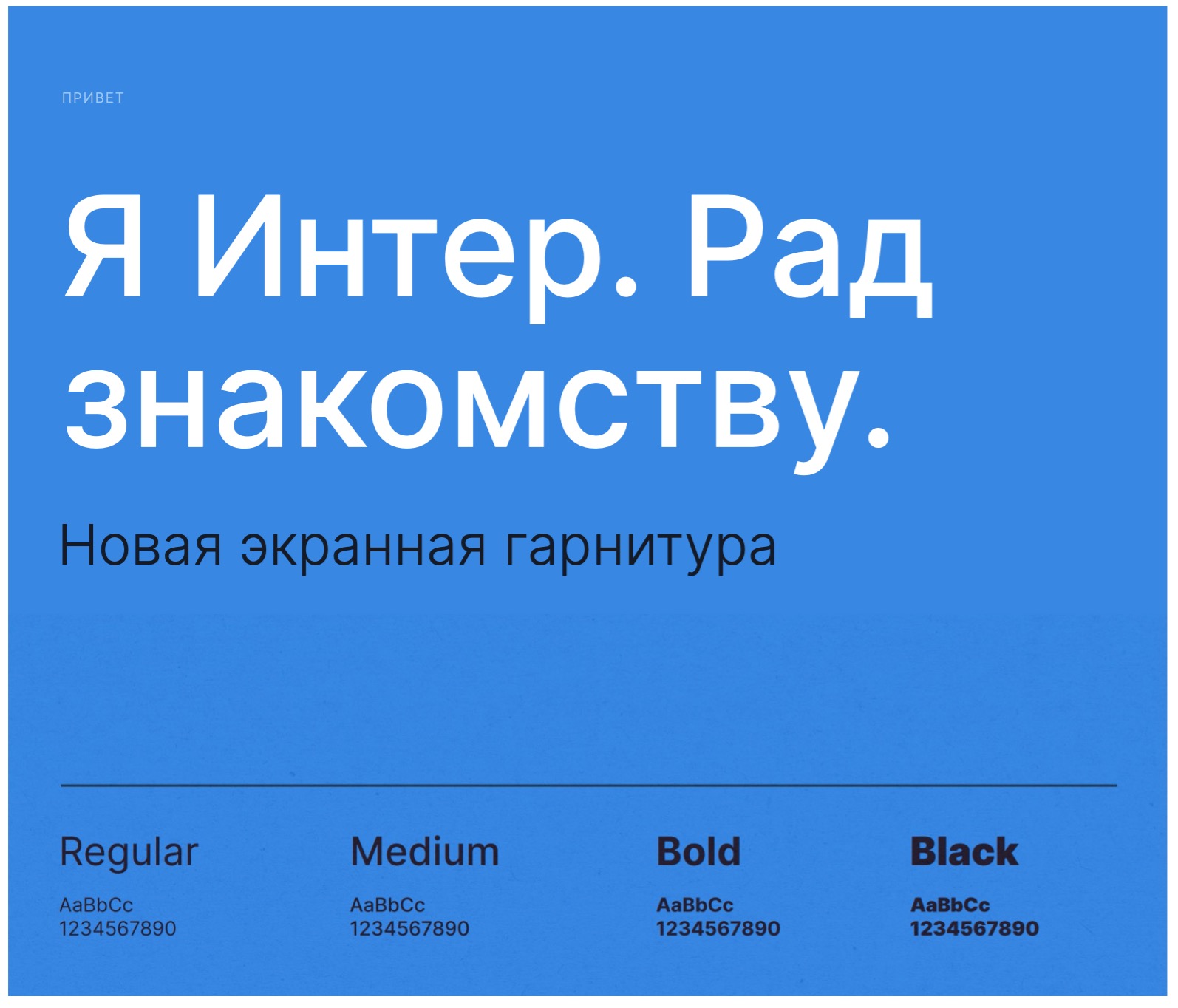
Открыл для себя современный нео-гротеск Inter (https://rsms.me/inter/)
— Бесплатный (SIL Open Font License 1.1)
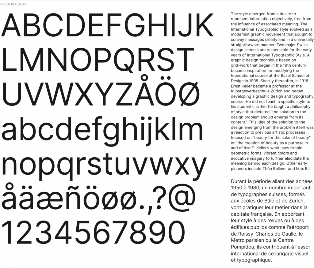
— 9 групп начертаний (от Thin до Black)
— Хорошо читается в мелком размере
— Есть кириллица (но странная)
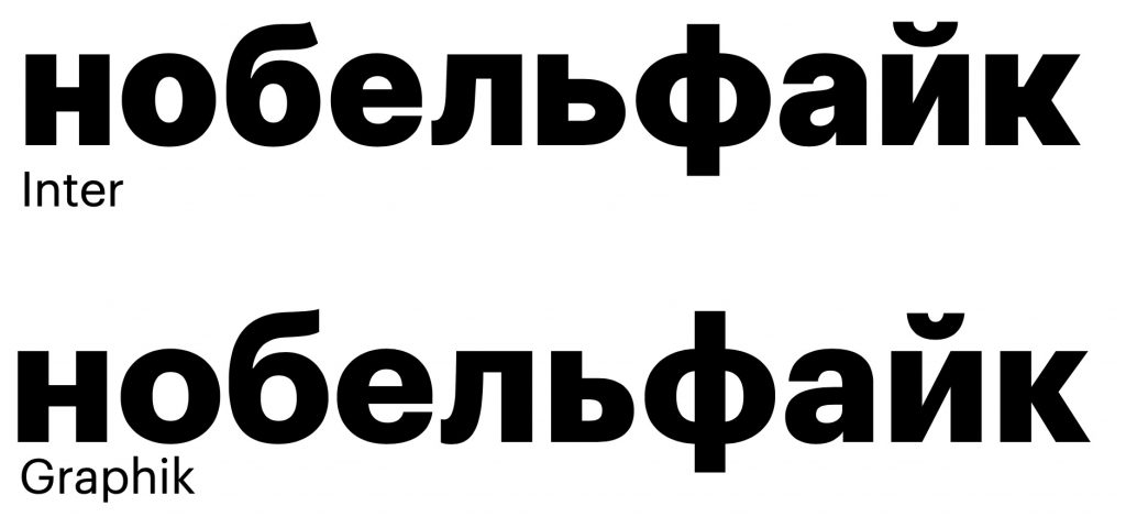
Чем-то Inter в жирных начертаниях напоминает популярный в последнее время Graphik. В других стилях он больше какая-то скандинавская Helvetica (ну там Lab Grotesque какой-то, но менее плавный)
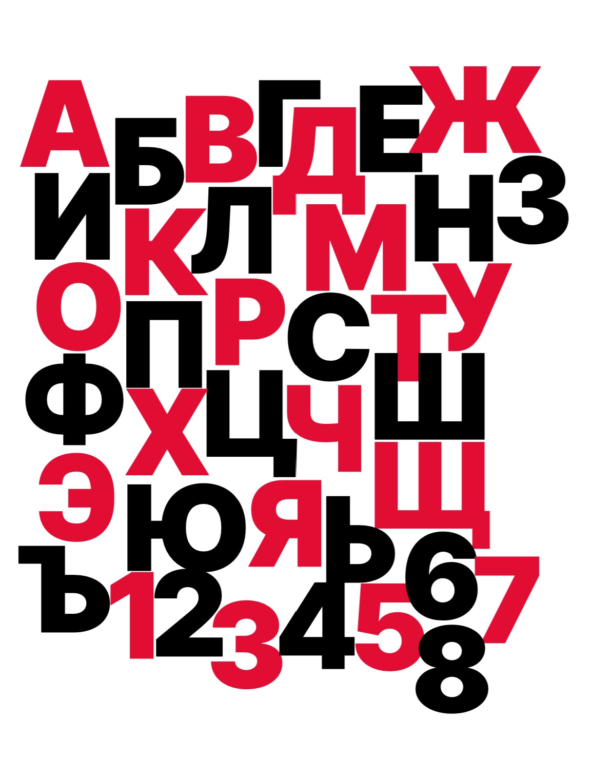
Теперь о кириллице
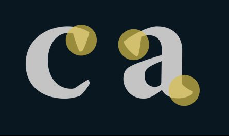
у Inter-а странная кириллица. Автор хорошо постарался — большинство кириллицы несильно режет глаз, но вот буквы «д» и «л» себя выдают. Как я понял, в команде не было русскоязычных дизайнеров. Поэтому я взял и исправил «д» и «л» в начертании Black.
Проверьте себя — какая из букв вам кажется более кириллической (мой ответ внизу)
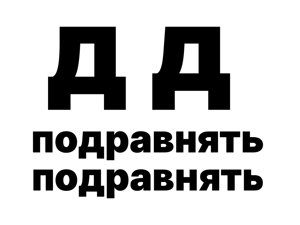
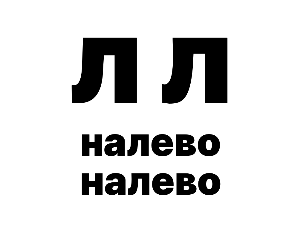
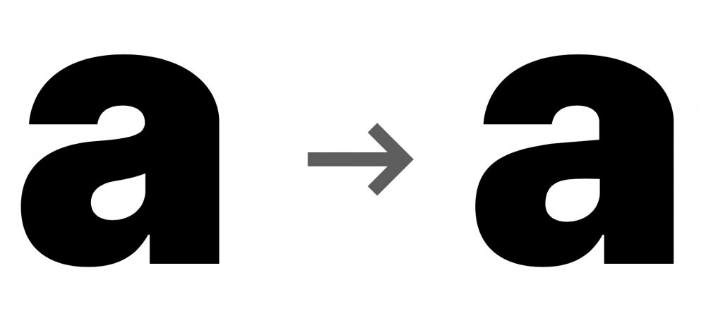
Моя версия «д» — слева, «л» — справа. Ещё взял и переделал ну очень гельветичную «а» в более гротескную. С гельветичной «а» нет проблем, просто она лично мне приелась.
ИТОГО
Если вам почти Graphik, но бесплатно, то Inter раздают на сайте проекта https://rsms.me/inter/ и он есть на fonts.google.com. А моя версия Inter Black лежит тут: https://www.dropbox.com/s/bsicb1e37irpj3d/Inter-Black_ABedit.otf?dl=0
Update 2021:
Почитайте интересное интервью с автором шрифта. Человек сам все делал и кириллицу тоже. На чистом энтузиазме.
P.S. Если вы качаете для своего проекта или нового проекта, то не скачивайте с fonts.google, там лежит крайне устаревшая версия. Автор выпустил новую версию (https://rsms.me/inter/) и она гораздо лучше, хотя проблемы с кириллицей все те же, но это нестрашно. Это не самые серьезные проблемы.
— In English —
Typeface Inter
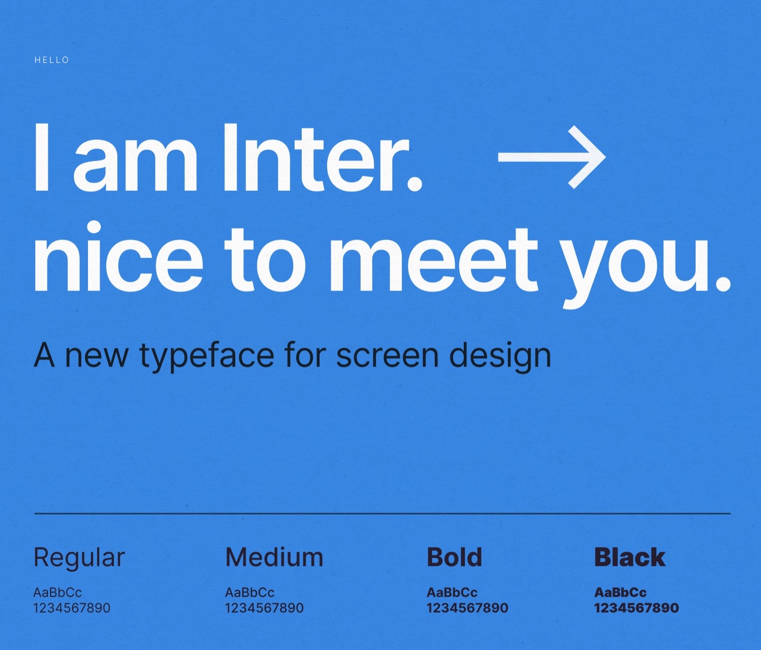
I have discovered a modern neo-grotesque typeface Inter
— It is free (SIL Open Font License 1.1)
— 9 styles (from Thin to Black)
— Good legibility in small sizes
— Supports Cyrillic (but it is weird).
Somehow Inter Black reminds me of the popular Graphik typeface, but that only occurs in Black style. While the rest styles are more like a scandinavian Helvetica (a Lab Grotesque but more elegant and sophisticated I suppose).
Now for the sad part, Inter has a weird Cyrillic.The guys tried hard — most of the Cyrillic is not very irritating to the eye, but the letters «d» and «l» give themselves away. As I understand, there are no Russian-speaking designers in the team. So I was bold enough to fix them in the Black style (kinda a stretch for my skills of a consultant).
Try yourself, which one of the letters you think is more Cyrillic (my answer is below).
My «d» is on the left, «l» is on the right. I’m not sure if I have made it better — I’m not a designer, but personally it would be more pleasant for me to type my name in this font. Oh, and I have changed a too much helvetica-style «a» into a more grotesque one. There is nothing wrong with the former «a», I just prefer the latter one.
Summary: If you need a free modern legible neo-grotesque typeface with a flavour of Graphik/Hevletica/Scandinavia, then you should give Inter a try. Go grab it at https://rsms.me/inter/ or at fonts.google.com. My version of the Inter Black is here: https://www.dropbox.com/s/bsicb1e37irpj3d/Inter-Black_ABedit.otf?dl=0 (as-is, no warranties)