
UPDATE 2023: Being now quite a seasoned typeface editor it is kinda hilarious to read this post. Of course I didn’t fixed EB Garamond, I was so ignorant in typefaces that I didn’t know anything about OTF features and that the typeface had already had the lining numbers.
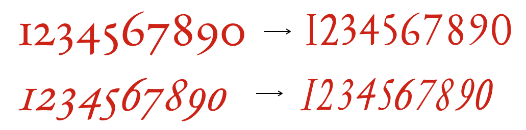
Меня так достали средневековые скачущие цифры в шрифте, что я взял и исправил их на современные. Оказалось, что редактировать шрифт — не сложнее, чем работать в PowerPoint-е. Но обо всем по порядку.
I got so sick of looking at the medieval jumping digits in that font so I took my courage and fix them. Made them look modern. It appears that editing a font is not that complicated task — not more complicated then editing a figure in at a PowerPoint slide. But first things first.
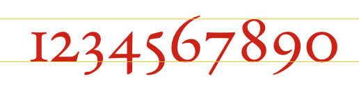
2 года я ждал, что автор шрифта возьмёт и добавит современные цифры. И он… не добавил. Поэтому я нагуглил редактор FontForge и подправил сам. Вышло странновато, если не сказать практически безнадёжно. Цифры узкие, угловатый нолик, не самый лучший кернинг и еще миллион претензий.
I waited for 2 years for the font’s author to add modern digits. And he… didn’t. So I googled an open source editor FontForge and fixed the digits all by myself. It came out a bit odd, if not to say beyond hope. Digits are too narrow. A zero digit has corners, but it shouldn’t. Not the most precise kerning and million other flaws.
Вот починил шрифт и прямо чувствую прилив мускулинности.
I have fixed the font and now I’m feeling so mannish.