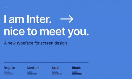
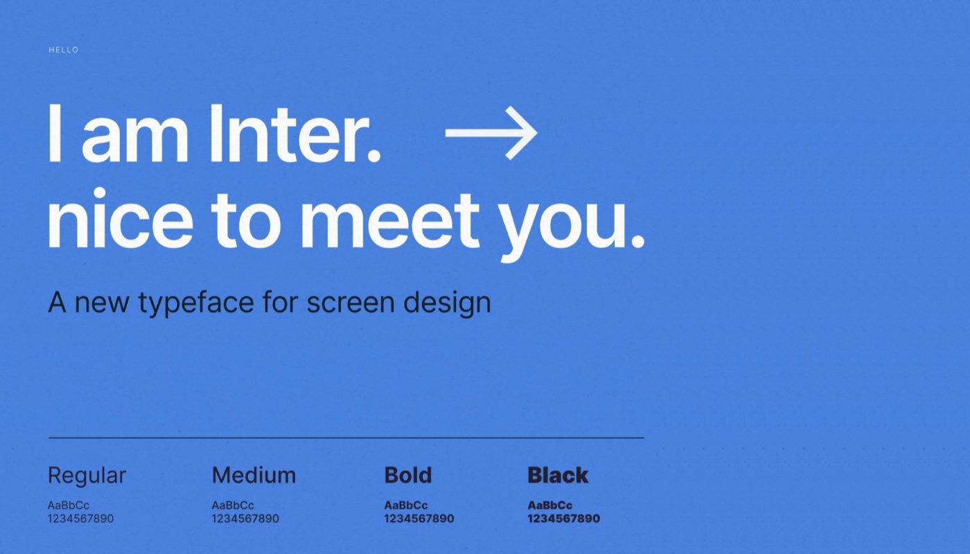
I have discovered a modern neo-grotesque typeface Inter
— It is free (SIL Open Font License 1.1)
— 9 styles (from Thin to Black)
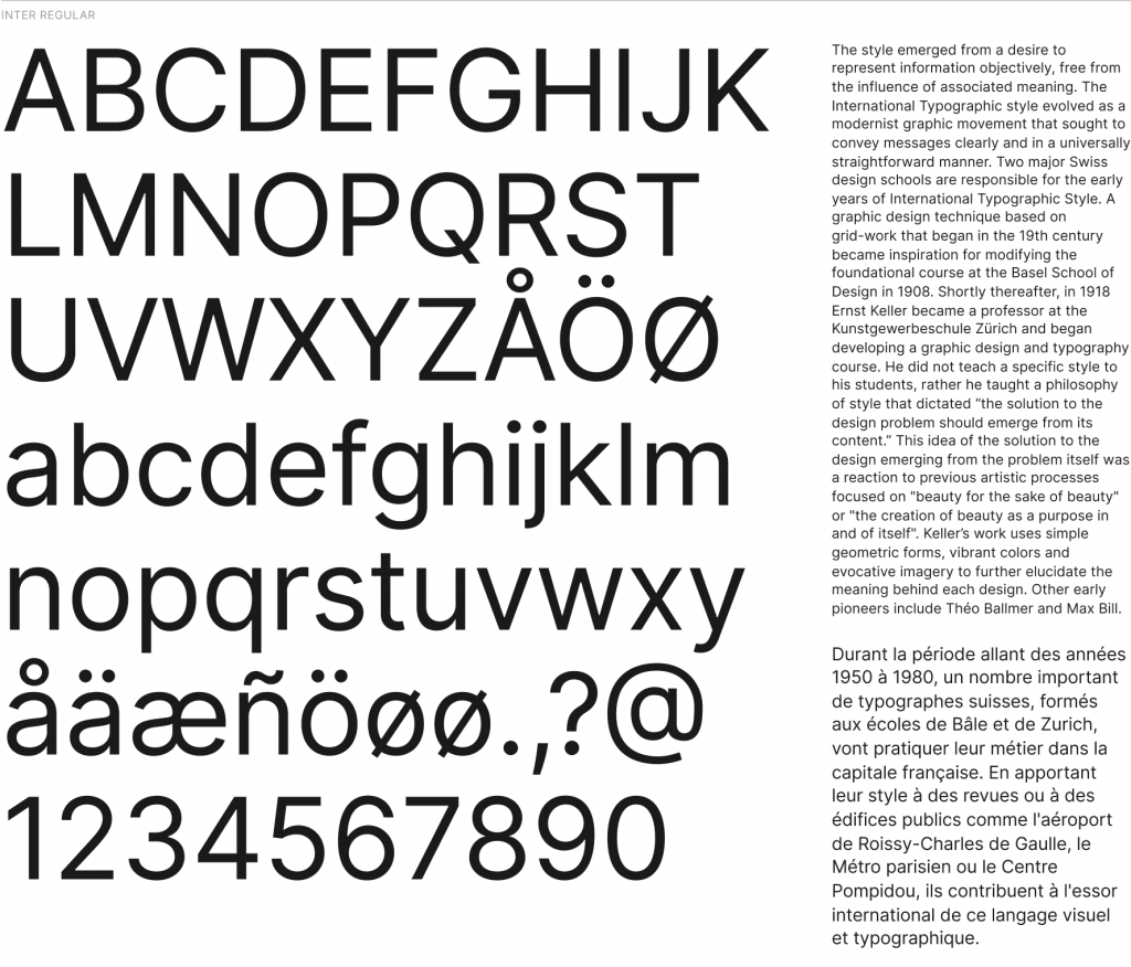
— Good legibility in small sizes
— Supports Cyrillic (but it is weird).
Somehow Inter Black reminds me of the popular Graphik typeface, but that only occurs in Black style. While the rest styles are more like a scandinavian Helvetica (a Lab Grotesque but more elegant and sophisticated I suppose).
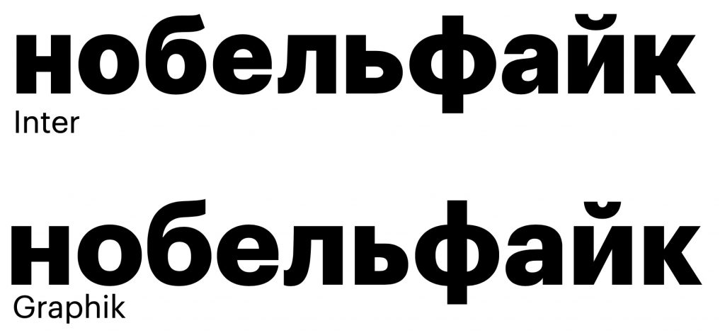
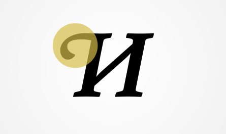
Now for the sad part, Inter has a weird Cyrillic.The guys tried hard — most of the Cyrillic is not very irritating to the eye, but the letters “d” and “l” give themselves away. As I understand, there are no Russian-speaking designers in the team. So I was bold enough to fix them in the Black style (kinda a stretch for my skills of a consultant).
Try yourself, which one of the letters you think is more Cyrillic (my answer is below).
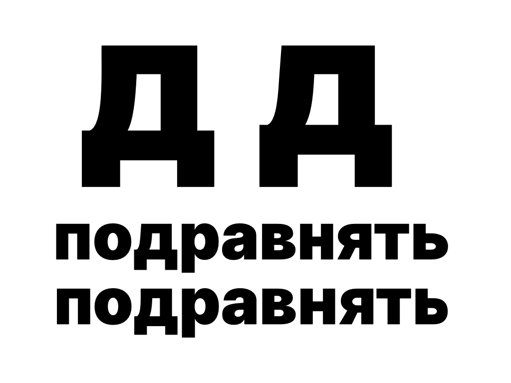
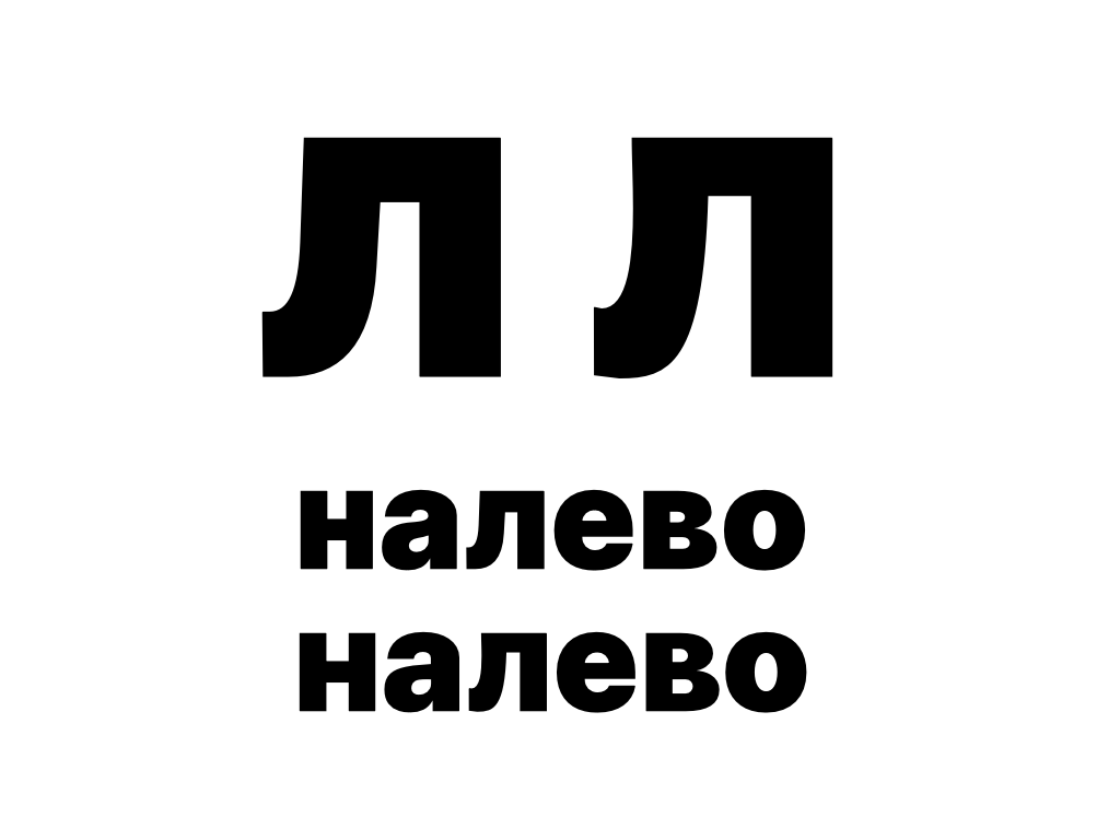
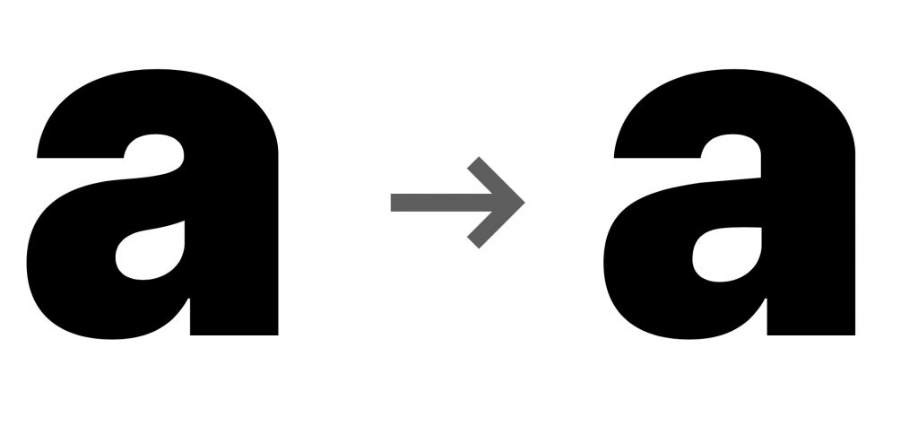
My “d” is on the left, “l” is on the right. I’m not sure if I have made it better – I’m not a designer, but personally it would be more pleasant for me to type my name in this font. Oh, and I have changed a too much helvetica-style “a” into a more grotesque one. There is nothing wrong with the former “a”, I just prefer the latter one.
Summary: If you need a free modern legible neo-grotesque typeface with a flavour of Graphik/Hevletica/Scandinavia, then you should give Inter a try. Go grab it at https://rsms.me/inter/ or at fonts.google.com. My version of the Inter Black is here: https://www.dropbox.com/s/bsicb1e37irpj3d/Inter-Black_ABedit.otf?dl=0 (as-is, no warranties)