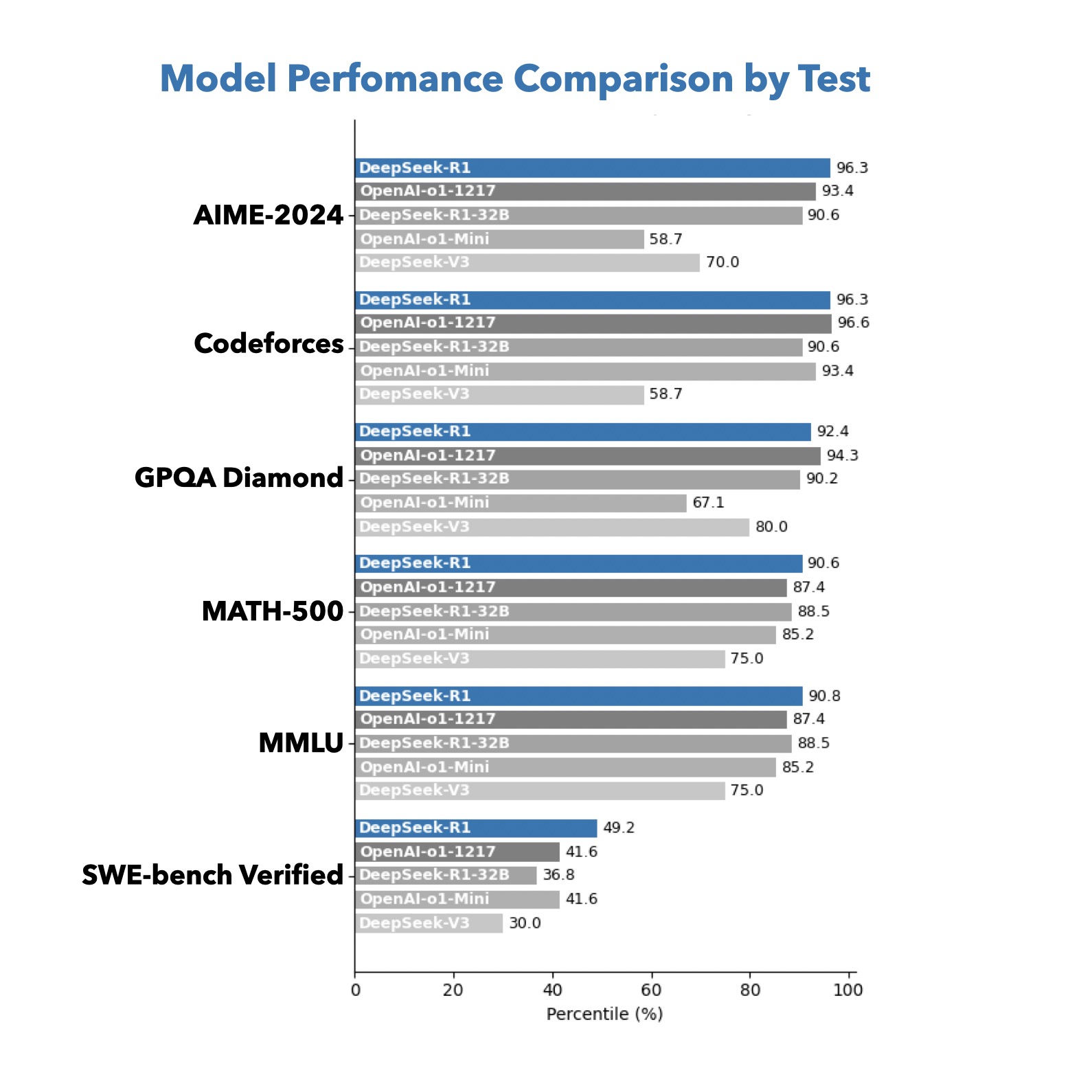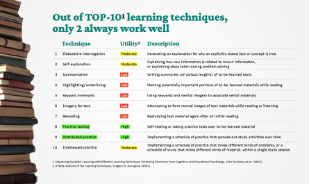
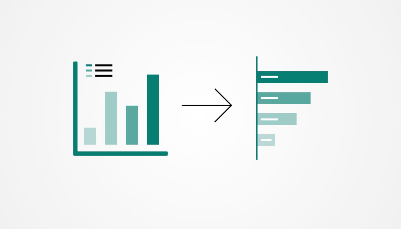
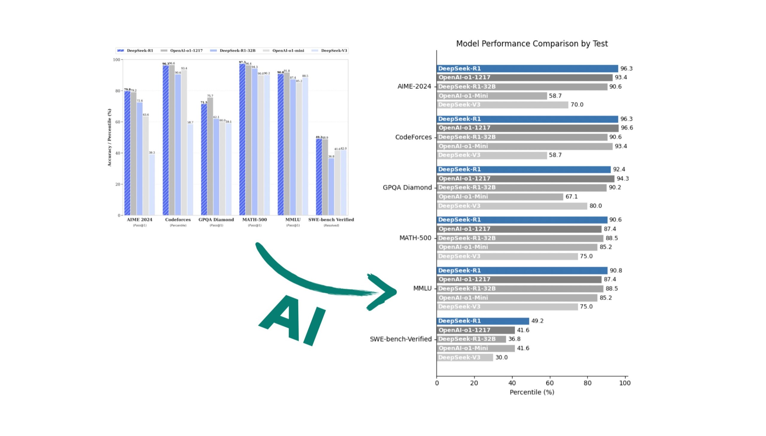
My eyes start twitching the moment I see someone else’s bar chart with a legend that forces me to play “tennis”—more than two values in the legend, and I am no longer looking at the data, just training my eyesight.
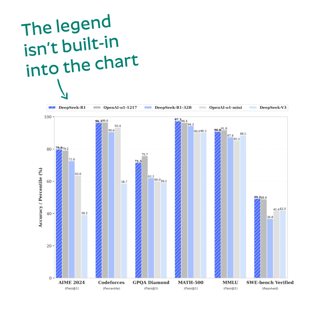
If the chart were in an editable PowerPoint format, no problem—I’d turn the column bars into horizontal bars, add human-friendly labels over the bars, and voilà, beauty in 5 minutes. With ThinkCell or Ampler plugins for PowerPoint, even faster. But no, sometimes all you get is a screenshot, and redrawing everything from scratch… not exactly my idea of fun.
Thank god for AI, which can do it for me.
AI prompt:
1. Remove the separate legend
Eliminate the legend box and incorporate series labels directly into the bars for a self-contained design.

2. Group related series for each category
Ensure all related bars are plotted side by side for each category to provide clear groupings.

3. Separate series labels and actual values
– Place the series name at the beginning of each bar (only inside near the base of the bar).
– Place the actual value at the end of the bar for clarity and easy interpretation.

4. Use distinct colors
Assign each series a unique color to help visually differentiate between them.

5. Switch to a horizontal bar chart for readability
Use horizontal bars to allow easy reading of both labels and values. Text labels should remain in a natural horizontal orientation.

6. Add clear axis labels and titles
– Label the x-axis with the data being measured.
– Add meaningful y-axis labels (e.g., benchmark categories) and a clear, concise chart title.

7. Ensure minimalist, clean design
– Adjust font sizes, spacing, and layout to avoid clutter.
– Use thin gridlines and subtle colors to improve readability without distraction.
– Avoid unnecessary decorative elements that do not contribute to understanding the data.

8. Label positioning considerations
– Ensure labels (both series names and values) do not overlap or crowd.
– Use contrasting text colors where necessary (e.g., white text on dark bars and black text on light bars).

9. Check again that the visualization does not have any legend box, values of the bars are at the end of them, names of the bars are inside each bar)

10. Save and format the visualization
– Export the chart in high resolution for use in presentations or reports.
– You may write a code to run that will generate the final visualization
The method is not universal:
- AI might miss some of the bar values (DeepSeek gets it wrong more often, ChatGPT-4o/o1 less so), but if the numbers are small or missing altogether, you will have to type them manually.
- The generated charts are common at best (common way the Python lib generates them) — custom styling requires 2-3 extra commands:
— Make the bars labels bold and white.
— Add some “white” space between the bars.
— Highlight the bar labeled X in blue everywhere, the rest should be 55 shades of gray
— Some of this fine-tuning I prefer to do directly in Keynote/PowerPoint.
But in the end, we get an easy to scan chart. You can tell AI created it, but at least we have saved ourselves half an hour of life.