Here is the Sam Altman’s keynote video from the OpenAI DevDay and below is an excerpt from the review by Nancy Duarte.
There is some praise and some criticism, but the latter is unspecific, like this for example:
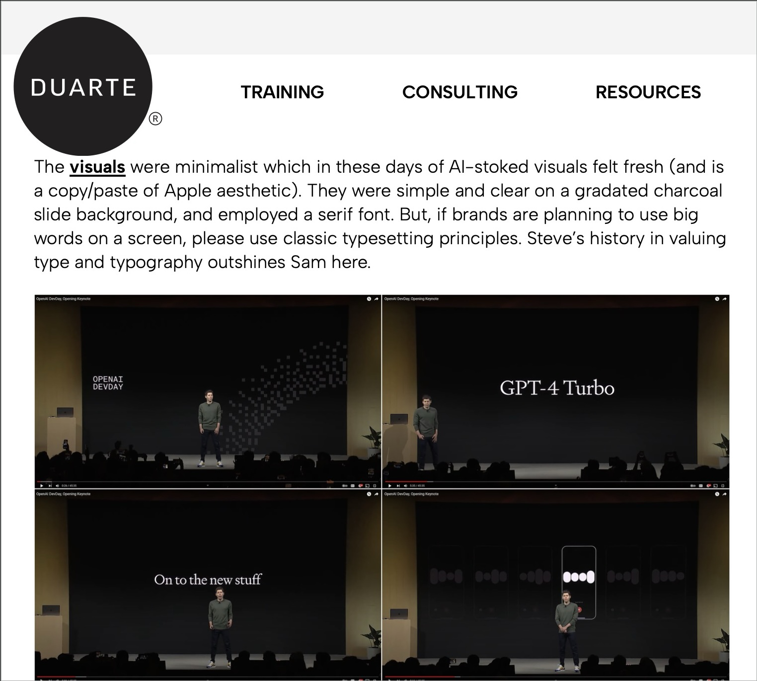
But, if brands are planning to use big words on a screen, please use classic typesetting principles.
Something is wrong with the big words on the slide, okay, there are many such slides and this remark is quite specific. But it is unclear what are these “classic typing principles” and on which slides specifically they were not adhered to? Maybe the slide designer himself will figure it out, but most of the regular PowerPoint users won’t. As a result, either they will simply give up using simple slides with large text, and for no good reason, because it is a very economical and effective way to create a decent slide – 15 seconds, three words in the center and the slide is ready. Or (who knows) will consider that the serif font used on the slide is bad, which again is for nothing. Because Signifier typeface used on the slides is a bold move indeed. It’s a font that manages to convey the feeling of something classic and futuristic at the same time, which is perfect match for a company like OpenAI and its mission.
In my opinion it would be better to show some examples
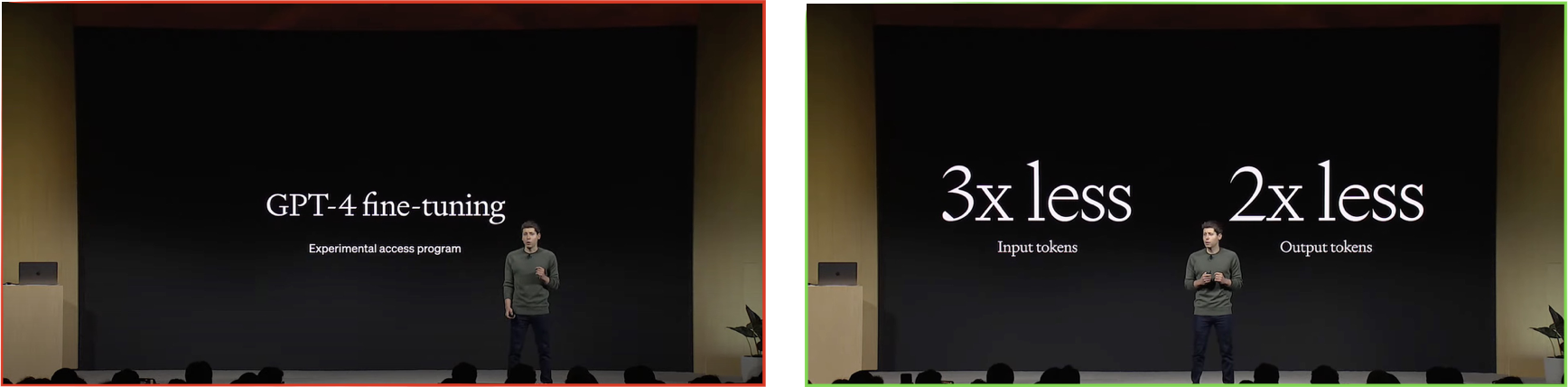
1. You should not suddenly put slides with sans serif typeface: they look out of place against other slides. It is better to set them in serif typeface.
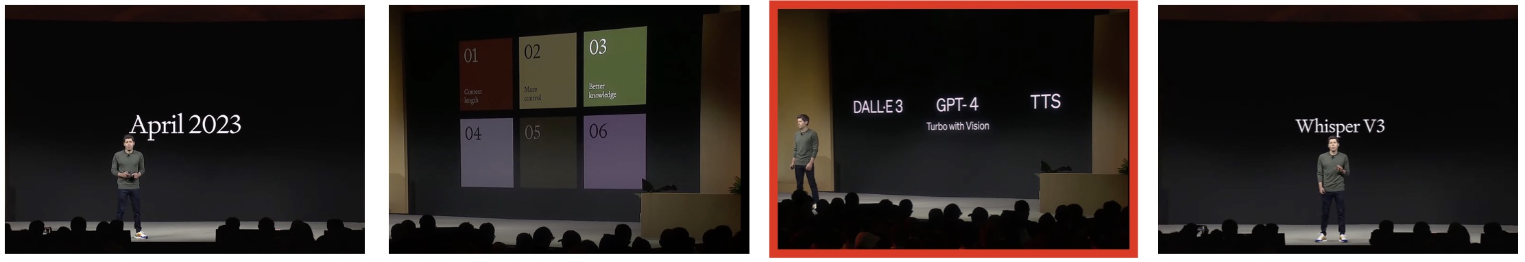
2. You should not mix fonts that are not the most harmonious with each other: Soehne (sans serif) and Signifier (serif) are not the best pair, and the boldness of Soehne is too heavy for Signifier’s lettering. It’s better to just type everything in one font, because Signifier is quite readable in such sizes.