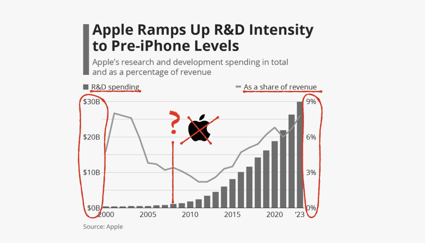
I like what Statista does with its data, but this one has caught my attention as a nice and clean from the first glance, but a bit hard to comprehend when you dive in:
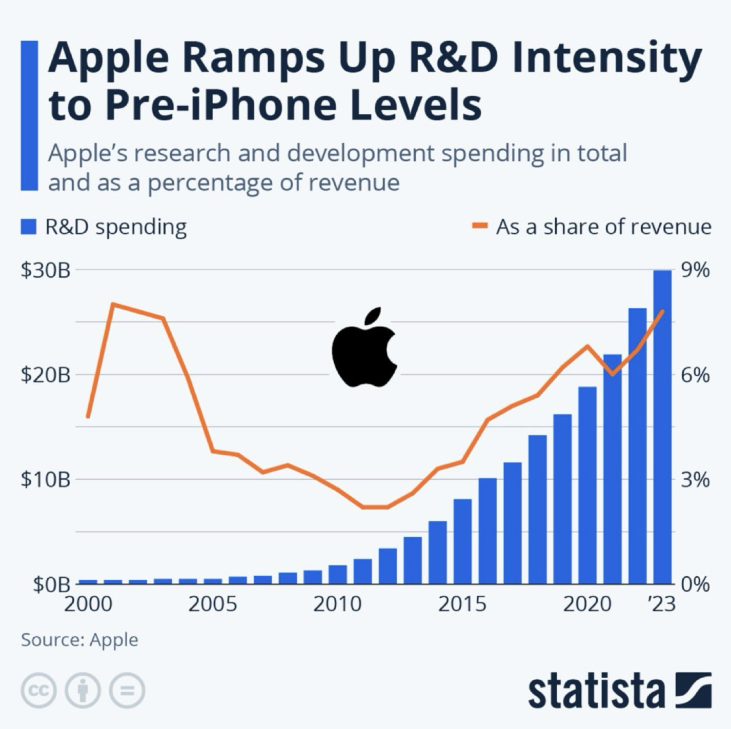
- The obvious flaw is the mismatch position of the percents and billions. 9%-6%-3%… are closer to the blue columns but they are referring to the orange line. The same goes with the $30B-20B…. We need to swap them and paint them with appropriate colours of orange and blue.
- Legends are not close enough to the appropriate line and columns. You have to move your eyes up and down to figure it out. Better to move legends as close as possible to the objects they are referring to.
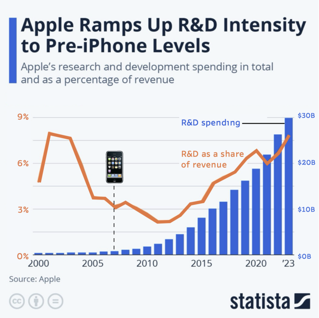
- The original chart refers to the Pre-iPhone levels, but I don’t remember the exact release date for the first iPhone, so it it better to add this point.
Source:
- https://www.statista.com/chart/2502/apples-r-and-d-expenditure/